“Demographic trends” and UW-Stevens Point

To follow up on the previous post, I looked at population projections for the area served by UW-Stevens Point (UWSP). Again, demographic shifts are one of the key justification for the dramatic restructuring of this campus. From the UWSP press release, “This repositioning is necessary because of declining financial resources, demographic changes with fewer students in K-12 schools and rising competition among public and private universities.”

As with Cross’s use of demographics for the restructuring, the media has echoed this perspective. Examples here (“Shifting demographics in which there are fewer high school graduates looking to enter college”), here (“Enrollment falls at several UW System campuses this fall as state’s demographics shift”), and here (“Shifts in high school graduation numbers, population growth possible causes”). Press releases from UW System, UWSP, and similar reporting have successfully created a narrative that declining numbers of high school graduates justify the dramatic changes.

So, let’s have a look at the data.

First, UW-Stevens Point has been presented as a regional campus serving a local community of central and northern Wisconsin. Examples from press release, “UW-Stevens Point can move forward with…renewed capacity to improve our service to the students and communities of central and northern Wisconsin, which are complex, diverse and ever changing.” And, from the Point Forward plan, “Eliminating some majors while simultaneously investing in other new and expanded majors will strengthen our ability to meet student and regional needs.”

What is UWSP’s “region?”

Data from their 2015 Factbook provide enrollment by county in the state. Mapped, it looks like this:

Viewed geographically, the “region” served by UWSP isn’t as clear and certainly highlights the number of students coming from eastern and south central Wisconsin. UWSP appears to draw from a mix of urban and rural counties in the state and defies a simple delineation regional delineation.

Let’s take one approach to assess demographic trends. If we look at the top seven counties that the campus serves (as of the 2015 data), we get (in rank order): Portage, Marathon, Wood, Outagamie, Dane, Milwaukee, and Brown Counties.

So, what are the demographic trends in these counties?

The UW-Madison Applied Population Lab’s projections mentioned in the previous post also provide county-level projections. Overall, these data project a 7.3% increase in the available number of high school graduates within these seven counties. Here’s a graph of the trend (and link to the source data):

pubchart

Again, these data undermine both the justification for the dramatic restructuring of UWSP and the perceptions of what constitutes UWSP’s “region” that they serve.

Given how easy it is to find and compile this data, I wonder how sincere UW System and USWP administration are in trying to truly understand the challenges our campuses face and what constitutes viable options moving forward. Currently, they seem to be more more grounded in ideology than fact.

“Demographic trends” and restructuring the UW System

Recent population projections show an increase of high school graduates in the state — not a decline — undermining the UW System’s justification for substantial restructuring.

If you’ve been following the latest Wisconsin political saga, you’d know that the University of Wisconsin System is again under attack — but mostly from within. Recent declines of enrollment at UW College’s two-year campuses — a combination of the post-recession recovery and recent decreases in high school gradates — has provided UW System with a crisis. And, of course, a good leader never lets a crisis go to waste.

In response, President Cross launched his plan to dramatically restructure the UW System in October, 2017 (link to press release). While their have been multiple concerns raised about this plan, I want to address “demographic trends” in Wisconsin, a key justification for the restructuring and one picked up by related media coverage. Cathy Sandeen, Chancellor for UW Colleges, was quoted as saying:

“The dramatic demographic declines in this state are undeniable and we have been working hard to ensure the future viability and sustainability of our small campuses.”

The press release additionally provides this table:

Capture

That Wisconsin’s population is getting older is no surprise to demographers and, of course, is a trend in most industrialized counties. But what was implied in these numbers and the way Cross spoke about them was that there were fewer high school graduate available to UW System schools — enrollments would inevitably decline.

The media, of course, took the bait and furthered the misconception. Here’s the Milwaukee Journal Sentinel, Enrollment falls at several UW System campuses this fall as state’s demographics shift,  and in the Wisconsin State Journal, Cross is quoted as “Our goal here is to leverage our resources to avoid closures, focus them in areas and respond effectively to these demographics.”

Of course, the logic doesn’t follow. Just because there’s a decline in the proportion of college-aged population doesn’t mean there’s a decline in the absolute number. And, of course, it’s that number that’s relevant to colleges and college enrollment.

Conveniently, UW-Madison’s Applied Population Lab recently completed (in Dec. 2017) an analysis for UW System (website). No surprise, this report hasn’t received much attention. Here’s the key figure:

Capture

The number of high school graduate is projected to reverse recent declines and increase by 3.4% by 2025. The key justification for the restructuring is a short-term problem, not one that warrants the radical response.

While this report did come out after the restructuring plan was released, it’s clear that UW System was interested enough in the numbers to commission the report. Perhaps we haven’t heard about it since it undermined Cross’s key justification for the restructuring.


Visualizing recall signatures for Scott Fitzgerald

Lori, my wife, asked if there was any way to visualize the signatures she’s been collecting for the Senator Scott Fitzgerald’s recall. She was interested in both inspiring volunteers and in analyzing the distribution of signers. After finding a post about QGIS‘s Time Manager, this was relatively easy to pull off:

Short version of procedure

  1. Collect addresses in spreadsheet (LibreOffice).
  2. Modify date of signature to conform with Time Manager’s format and add random offset (so all signatures on the same day don’t appear at exactly the same time).
  3. Geocode using GPSVisualizer’s batch geocoder (built on Yahoo’s geocoder).
  4. Import delimited text (*.csv) file into QGIS. Export layer as shapefile.
  5. Create three versions as suggested by underdark and set Time Manager settings.
  6. Export sequence to series of images.
  7. Use AviSynth and VirtualDub to create video.

Scott Fitzgerald’s campaign contributions – received more from out-of-state than his own district

(Full disclosure — my wife is currently leading the recall campaign against Senator Fitzgerald; see Recall Fitz)

Several weeks ago I heard Mike McCabe from the Wisconsin Democracy Campaign (WDC) talk about the growing power of money in our state politics and, in his words, its equivalence to modern-day bribery. My attention had mostly been on the role of Citizens United in our national politics and not the details of state politics. I also discovered, in subsequent searching, that there’s a treasure trove of data the WDC’s campaign finance database. Here’s an initial look at my state senator’s, Scott Fitzgerald, individual contributions for the last election cycle (starting from Nov 5, 2009):

Click to view interactive map
(Click here for the full interactive map — WordPress.com isn’t friendly to embedded interactive maps.)

What is really interesting is how little of his money came from his own district. Approximately 86% of his contributions were from outside the 13th — only 14% came from within his own district. He received more money (15% of the total) from outside the state. Look over those out-of-state donors, I ran across the name “W. Preston Baldwin” who shows up as the chair on ALEC’s Private Enterprise Board.

Who, then, is he accountable to?

Note: only free and publicly available data and software (QGIS and LibreOffice) was used to generate this map on my personal computer.

Power, parking, and the first amendment

First Amendment rights apparently don’t apply for parking. That’s what the Johnson Creek police chief told me before hanging up. My wife, Lori Compas, and I were attending a protest at Diamond Precision Products in Johnson Creek, Wisconsin, today where Governor Walker was coming with a TV crew from CNN. I called to ask about the extensive “No Parking” signs that lined the streets around the company’s site and was told that they were put in place to protect public safety. When I asked for clarification on how the public’s safety was being improved, the police chief told me the conversation was finished and abruptly hung up.

Here’s a quick map of the area closed to parking (lines in blue) and the Diamond Precision Products facility (red plus sign):

Given that parking legally required nearly a quarter-mile walk along a couple of busy county roads and both elderly and parents with small children were attending the protest, improving public safety was obviously not the prime reason for the parking restrictions.

Even if protecting Governor Walker was a prime concern (removing parking from any potential sight lines?), these restrictions were excessive. Many of the closed streets were well beyond any location where the Diamond facility was visible.

The obvious conclusion: the police restricted access to hinder protesters.

Just felt I had to document the fact.

Recount as measure of voting irregularities

Update: the recount results are now complete and certified (available here). Waukesha had a total of 87 votes that were changed for Prosser and Kloppenburg resulting in a 0.07% error in the original count (not including the 14,000 vote election night snafu).

As the governor is poised to sign the controversial voter ID bill in Wisconsin, what seems to be lacking on both sides of the discussion is evidence of voting irregularities or fraud. An article from yesterday’s Milwaukee Journal Sentinel cites 20 prosecutions of voter fraud from the November 2008 election (none of which involved voting in someone else’s name), but citizens have been presented with little additional evidence of voter fraud.

Of far greater concern for voter confidence is the state’s ability to count votes correctly. Here, we do have evidence from the recount currently underway from the Supreme Court election in April. Certified results from every county except for Waukesha are available here from the Government Accountability Board. Adding up the total number of changed votes for each candidate reveals 1,271 votes that were missed or incorrectly counted in the original vote. Here’s what the distribution of changed votes looks like across the state:

Total changed votes in recount

Obviously, the totals are larger in more highly populated counties. Below is another map showing the percentage of the total votes cast — highlighting counties within the state with the highest proportion of discrepancies. The highest percentage was 0.76% change in Waupaca County — almost every one out of a 100 votes was counted incorrectly.

Percentage of votes changed in recount

If we’re looking to instill greater confidence in the electoral process, shouldn’t we start (as Senator Lena Taylor noted) by getting the count correct? Surely in our age of technology we could do substantially better.

Creative Commons License
This work is licensed under a Creative Commons Attribution-NonCommercial-ShareAlike 3.0 Unported License.

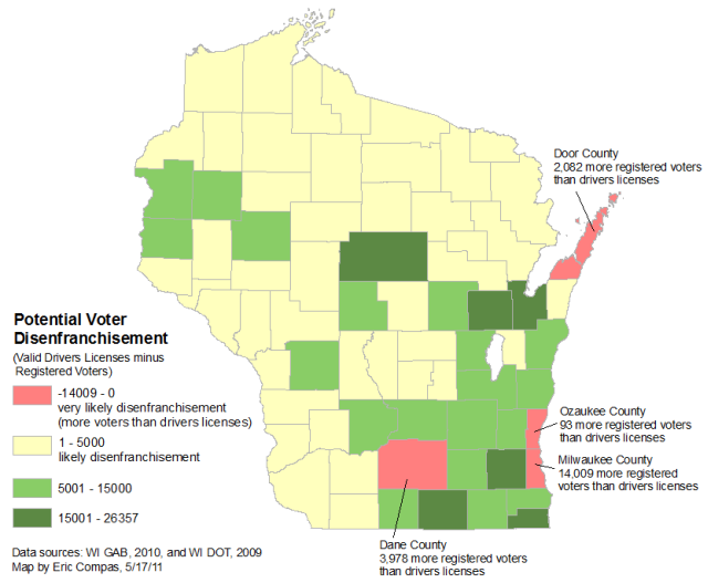
Potential voter disenfranchisement

As the Wisconsin Senate debates the proposed voter ID bill (SB 6), which requires a valid photo ID to vote, I was interested in the spatial distribution of disenfranchisement that might occur. Unfortunately, there’s little detailed data on registered voters and drivers licenses that’s publicly available for a comprehensive analysis. As a proxy, I’ve compared the number of valid drivers licenses from the Department of Transportation (available here for 2009) to the number of registered voters from the Government Accountability Board (available here for 2010).

Interpretation of this map requires caution for several reasons: 1) it doesn’t include all forms of ID that can be used (e.g. military IDs) for which detailed data isn’t available, 2) many drivers have licenses without a current address, 3) many drivers are not of voting age, and 4) the data are not from the same year.

Potential voter disenfranchisement

Several counties (Dane, Milwaukee, Ozaukee, and Door Counties) have more voters than drivers, meaning that currently registered voters within these counties will have to obtain new IDs to vote. The total voters without drivers licenses within these counties, 20,162 voters, is well within the margin of recent elections. The largest numbers are from Dane and Milwaukee Counties which have traditionally voted heavily for the Democrats. Will there be a differential impact on future elections?

Facebook share

Creative Commons License
This work is licensed under a Creative Commons Attribution-NonCommercial-ShareAlike 3.0 Unported License.

Supreme Court election results and recall senate districts

As suggested by comments on yesterday’s map, here are maps showing the districts of republican and democratic senators facing recalls superimposed on the Kloppenburg/Prosser results (note the change in color scheme to portray the middle of the distribution more appropriately for this map). Take caution in interpreting these maps. Given that senate districts cover portions of counties and counties vary considerably in their populations, the distribution and number of voters within each county could mean a substantially different “color” for the senate district as a whole. Ward-level election data would be much more appropriate for a recall analysis, but it’s not available for the whole state yet (will be available here).
Republican recalls


Democrat recalls
Sources: WI GAB and AP

Creative Commons License
This work is licensed under a Creative Commons Attribution-NonCommercial-ShareAlike 3.0 Unported License.

Design a site like this with WordPress.com
Get started